KOLL, brand identity
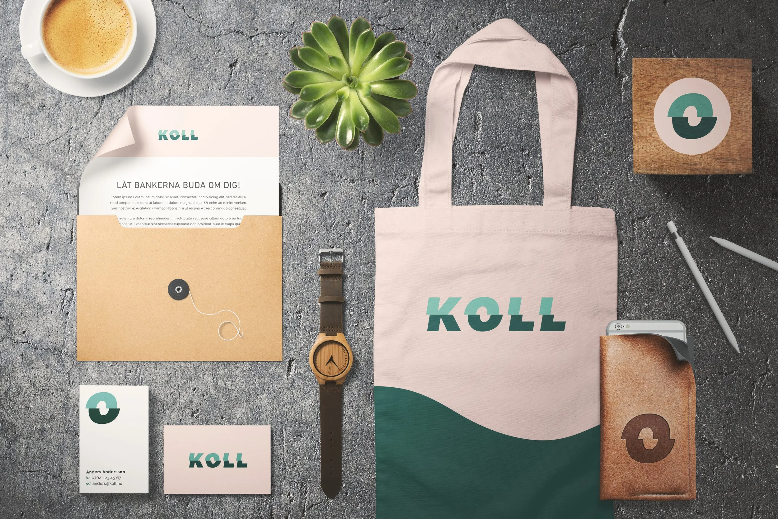
LånaBra rebranded to KOLL and needed a completely new brand identity that signalled trustworthiness and professionalism – but they also didn't want to be perceived as boring and bureaucratic, but instead modern, kind, warm and positive. In Swedish, koll means "to keep track/be aware of something". The O in the logo resembles an eye, keeping track, and can be used as a separate symbol. The glitch in the logo resembles the action of focusing, tuning in to see something clearly.
My role: Art director and brand designer
Client: Koll.nu